Christian Stolte
I know you do a lot of biology related data visualizations and creating tools and whatnot. Would love to hear what you’re mostly doing these days.
I just came back from a conference I helped organize in Cambridge, UK. It’s about visualizing biological data, called VizBIVizBI is an annual conference on visualizing biological data, bringing together biologists, designers, and data visualization researchers to share methods and tools for making sense of complex life-sciences data., and I’ve been attending almost yearly since 2011. The series started in 2010, so this year was the sixteenth meeting.
I’ve also been a speaker in the master class that’s part of the conference. This year we were talking about how to use AI in data visualization, and how useful is it at this point. What are the best techniques, the tricks, to get the most out of various AI programs when it comes to data visualization. The bottom line was, that part is still very much a work in progress, and they haven’t figured out a great way to do that yet.
You have a bunch of different projects on your website, and one of them is the DNA portraitsDNA Portraits from personal genomics data.. Could you tell me how that came about, and why you chose to show people’s DNA in that way?
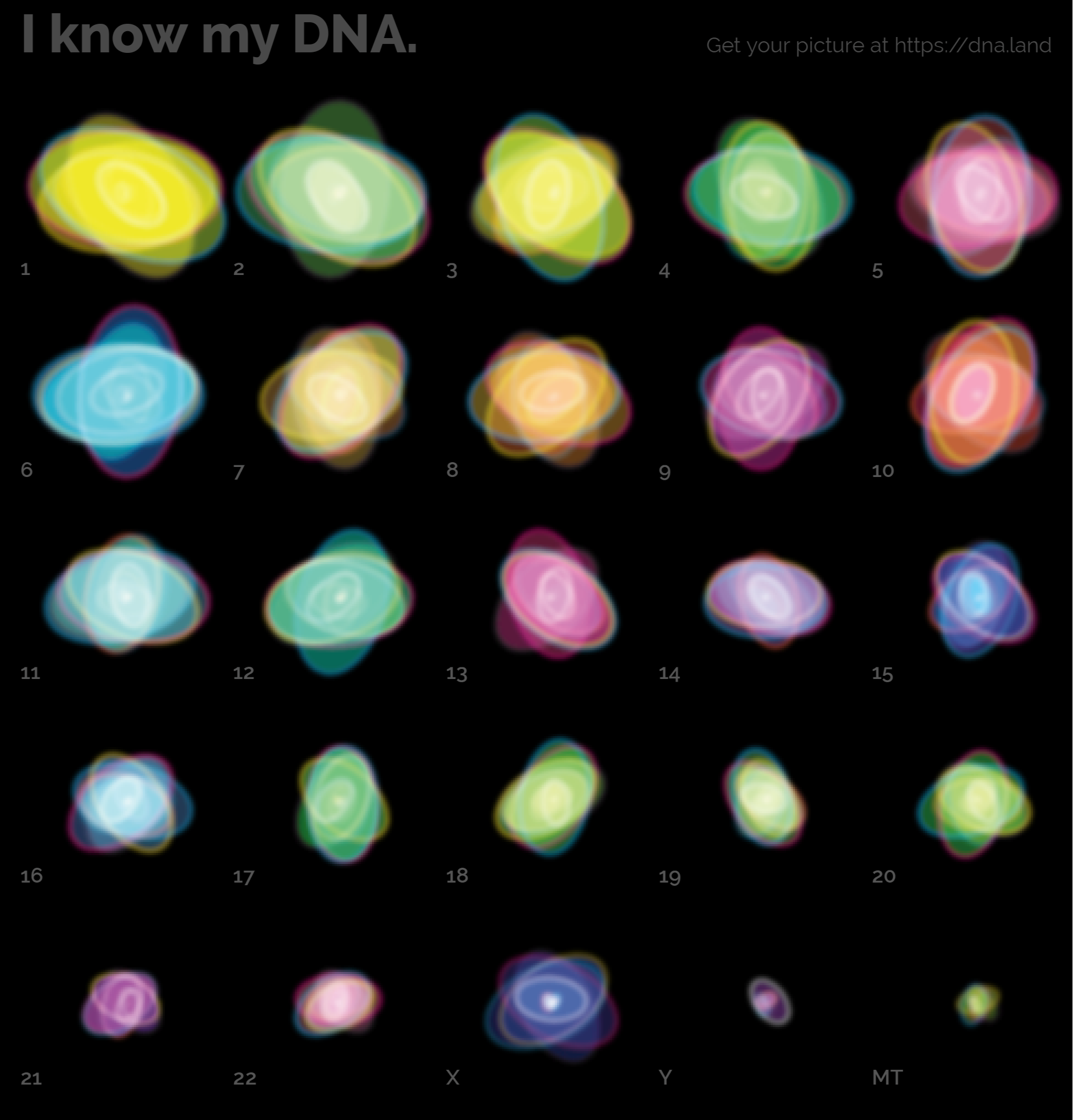
That project started a few years back when I first used 23andMe to get my own DNA looked at. As part of what 23andMe offers, you can download your own data, and the picture they give you is very limited. They sequence a small portion of your DNA, around a million data points that they basically cherry picked out of your whole genome.
Besides all the ancestry analysis and things like that, I was wondering: could I create some kind of image that shows you a snapshot of who you are genetically? And could I make that happen in a way that creates a different image for each person, but not in a random fashion. In a way that’s deterministic, so if you run the same person’s DNA data again, you get the same image.
I was curious to see how different different people’s genomes look. Can you really see a difference between you and me, or somebody else? I needed to find some way to summarize a million data points into a graphic that showed visible differences between the individual chromosomes, and between different individuals.
Since DNA is organized in chromosomes, I thought a good starting point would be one graphic for each chromosome. I decided I was going to take account of all the different nucleotide combinations you see. It’s simple combinatorics math. DNA only consists of four letters, and we have two letters for each position in the genome that 23andMe reads. One coming from your mom, one from your dad. That’s your genetic inheritance. For each position you either get two matching letters, or different letters. Or sometimes you get no read. That happens, because the process isn’t perfect.
To show the different letters, I encoded the combinations in different colors. I assigned the four printing colors (cyan, magenta, yellow and black) to the four letters of the DNA alphabet. G, C, A, and T. The four bases all DNA is constructed from.
When you get two A’s, that’ll be pure cyan, if cyan is A. If you get an A and a G, that would be cyan and yellow, so they combine to form a green. You get the idea. This way you can mix about eight different colors very easily.
So I created a page I call the generator, where you can take your data and display it a few different ways. You can experiment with different shapes: ellipses, rectangles, squares. It was kind of fun playing around with it.
The DNA is inherently a human thing. We’re made up of DNA.
Yeah. And when you render those ellipses as outlines, they kind of resemble the graphics you see for planetary systems. Everything aligned on one center, but with these different paths. That actually looked fairly poetic. They almost seem like galaxies. I know technically a galaxy is something very different, but they seemed like little planetary systems.
It’s beautiful. You have kind of the universe inside of you, in a way.
You could say. The reactions I got were sort of mixed. Some people just didn’t get it. Because there’s nothing but geometry going on, it was maybe a little too abstract for people to react to emotionally.
But at the same time, I got reactions from people who thought about it a little more, and they found it very pleasing and appealing. Because of that, a set of these graphics also ended up on a CD disc that was deposited on the moon.
A friend of mine was involved in that project, sort of as an art director. They burned all these images onto the surface of small CD-ROM-sized golden disks that were sent to the moon, and sit there like a time capsule, waiting for somebody to discover and decode them. We had a whole genome sequence embedded in there, and my representation of that same genome encoded in these outlines. It was just a black and white image, but it still looked very interesting.
That’s incredible to even think about. That this piece of data visualization you made is on the moon. Talking about the moon, it reminds me of the paper you sent me, ‘Why Science Needs Art,’Why Science Needs Art. Article from Frontiers in Bioinformatics, October 2025. that you contributed to. One of the first sentences mentions a film, A Trip to the Moon, 1902.A Trip to the Moon. French science-fiction adventure trick film written, directed and produced by Georges Méliès. Inspired by the Jules Verne novel From the Earth to the Moon. Even before any of the space exploration was done, it’s a piece of art. Then later, in 1969, you have Neil Armstrong and the other astronauts actually setting foot on the moon.
You can argue that art really helped inspire that space program. I don’t know if it would have happened without artists first imagining that trip to the moon.
In that way, art is a great way to just try things out with very little risk. You can imagine anything, and if you can make it visible to people, that can do all kinds of things. Even get them to build a real rocket that takes you to the moon.
These two, art and science, seem to be on opposite sides of the spectrum. And if we take parallels and talk about data and emotion, data feels like this rigid thing, and emotion is this abstract, ever-flowing feeling. In your project, you said some people didn’t get it, because you don’t have a rigorous connection between what the data is and what the visual is telling you. It’s not your usual bar chart. So how do you think that influences how people perceive the visual? Is having a more rigorous visualization always a good thing, or what are the reasons you choose to stay away from that and do a more artistic representation?
When you work with an artistic representation, that gives you access to the world of emotion in a way. You leave the logical thinking and the dry reasoning that goes into science behind, and you enter a world that is more based on reactions. That’s one of the roles emotions play in our lives all the time: they give us a way to make very, very quick decisions. People call it acting instinctively, or a gut reaction, because it’s so fast, it just happens without you thinking about anything.
That’s the big difference between science and art. Science requires you to really consider things thoroughly, and there’s a lot to understand and digest before you can make any conclusions. Often that’s what people find so frustrating: that scientists never really want to commit to anything. There are always qualifiers. Only if all these conditions apply, then this really holds true. Whereas with feelings it’s much more clear cut. You either are in love with something or you hate it, or you’re shocked, or you’re pleased. These things happen very quickly, and they’re very clear, and relatable.
By choosing a more artistic representation, I’m trying to see if people can react in that more spontaneous way.
The relatability aspect is interesting. Especially with the DNA stuff. You look at it and it’s like, that’s my DNA, that’s me. You relate to your own person, or someone else. Another human.
I tried out a couple of examples, I don’t think I’ve shown them to you, where I took a person’s silhouette and superimposed the DNA graphics into it. So you have a dark shadow that’s the outline of someone’s profile, like a shadow you’d cast on the wall if you had a light behind you. For most people you can say, okay, that looks like Christian, or no, that’s Sai.
That made it a little more obviously personal. Because these abstract graphics otherwise don’t make it possible to look at it from a distance and say, yeah, this is somebody I know, or show you a clear difference between two people. But if you combine it with that profile shadow, the silhouette gives you a way to identify quickly, and then you can dig in deeper.
So I’d probably continue down that road if I were to pick up the project again. Because it gives you a frame that just says, okay, here we’re looking at a human being.